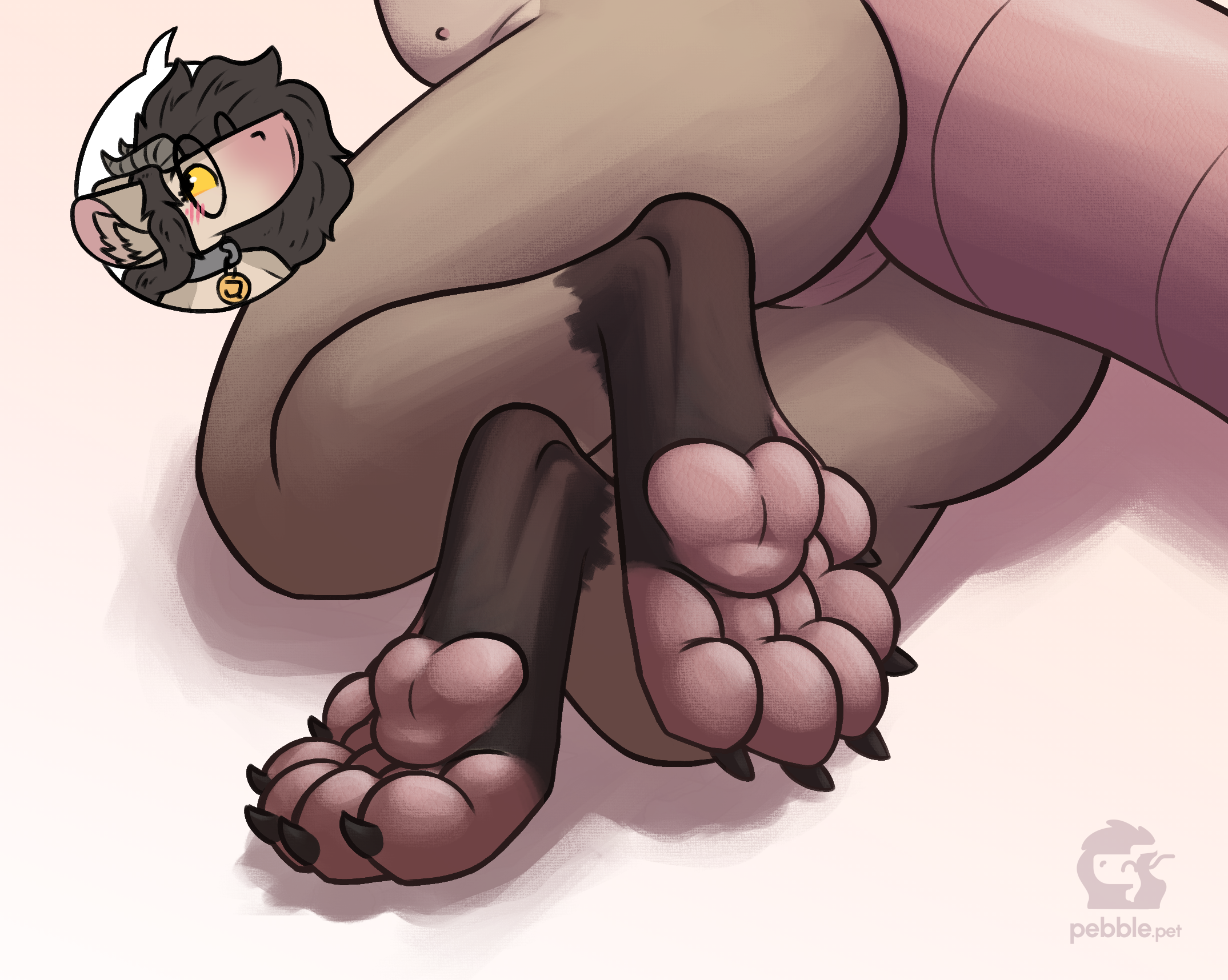
i thought i'd talk a little about the process of making the paw drawing from an artist's perspective, since it was a fun experiment in a lot of ways!
this post has a lot of images! please don't mind their layout, i don't wanna code a new image layout just for this one post >w>' you can click on them to expand them if you'd like
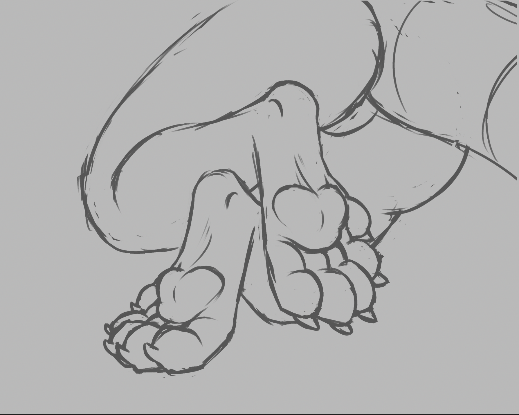
ok, so, the initial sketch had a lot of line thickness variance, but it was also too rough to try to clean up without spending a lot of time on it, so i did my best to try to preserve the variance while doing a line pass. i don't usually do this, so it was fun to try to figure out where the extra weight made sense vs where it was just a byproduct of struggling with the shape during the sketch phase - interestingly there was a lot of overlap! difficult shapes tend to be the ones that look good highlighted, turns out
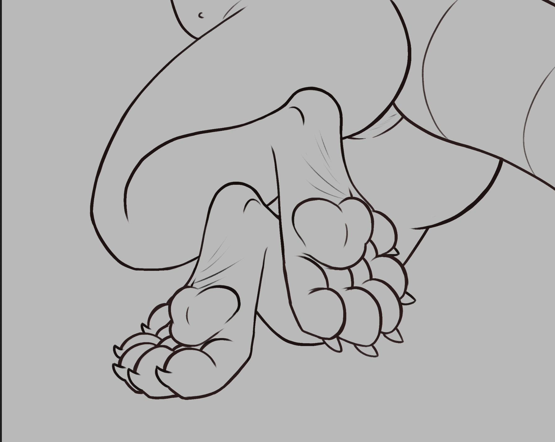
in terms of shading, i picked a more difficult light source position (above) than i usually do, i thought it'd be fun with the complex shapes to try to figure which parts the light would hit. i also put extra effort into using shading to highlight certain anatomy, specifically the "heels" here. in a lot of art i like i noticed that artists often use shading to highlight details that aren't lined or colored, so i wanted to practice doing that too! i think i'll be trying to do that more in the future. sometimes i like to compare the process of soft shading to like, carving out a statue, and on the pic below you can kinda see what i mean! in essence the process is very similar (erasing out pieces to make shapes come to life). i also put a slight gradient over the shading layer, i figured it'd add a nice touch.
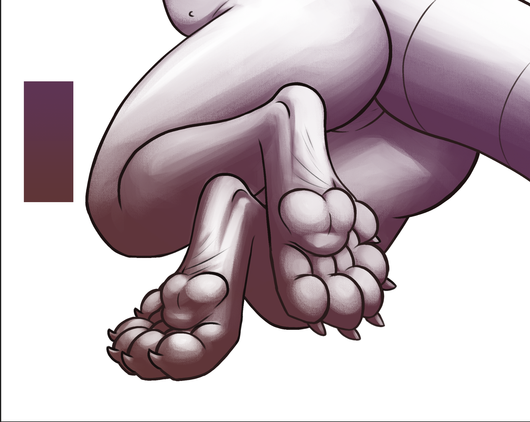
even with all the shading i wanted to make the focus of the drawing pop out more, so i decided to add little shiny highlights that point towards the light source. despite being a really small detail i feel like it adds a lot. cue the meme that's like "horny vs not horny" and the only difference is a few shinies dfgjh

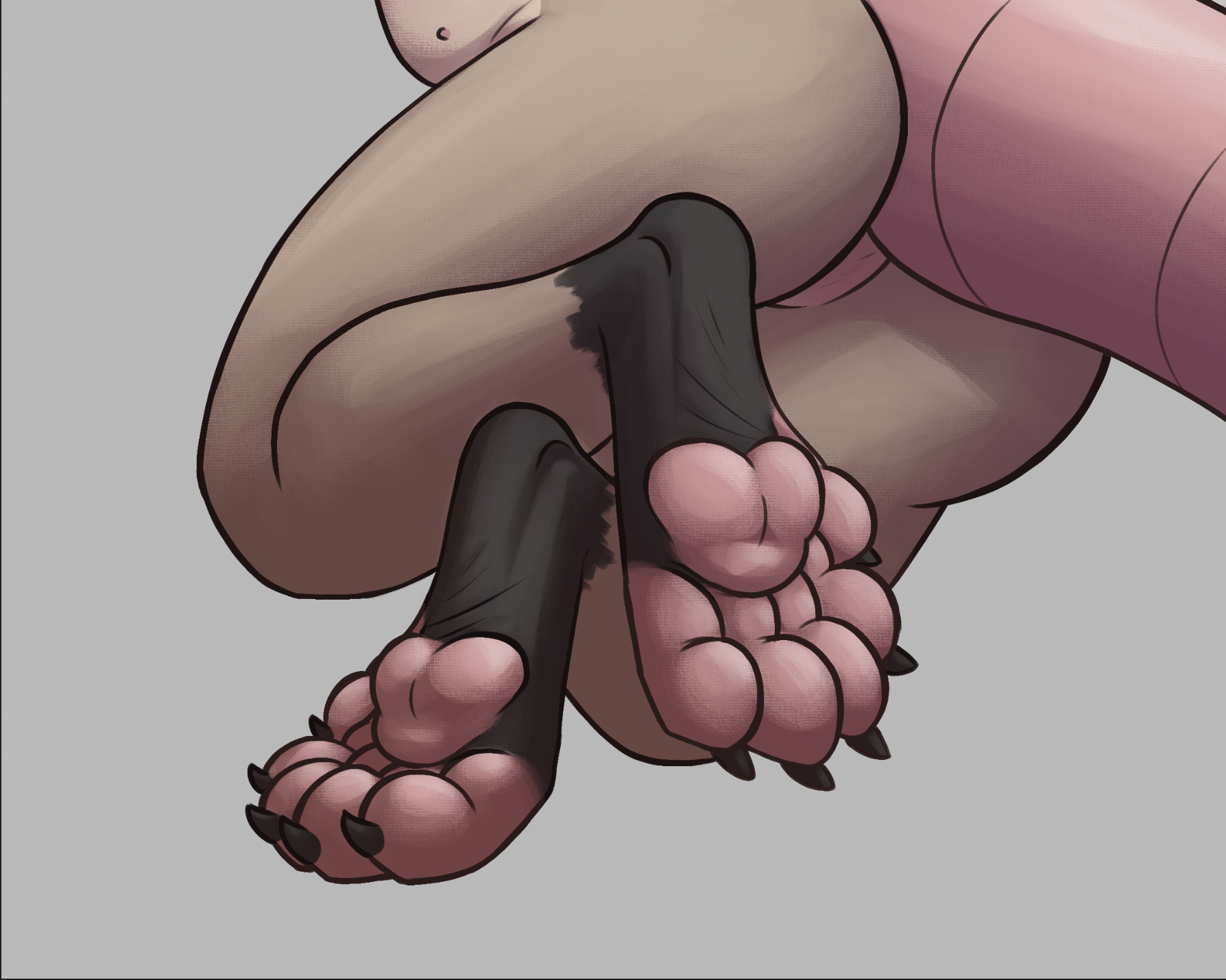
then to add a little warmth i added an orange gradient over top, erased out the spots where light doesn't hit, and set the blending mode to color dodge. it's like barely noticeable, but i feel like shifting the color temperature of the light with this looks neat!
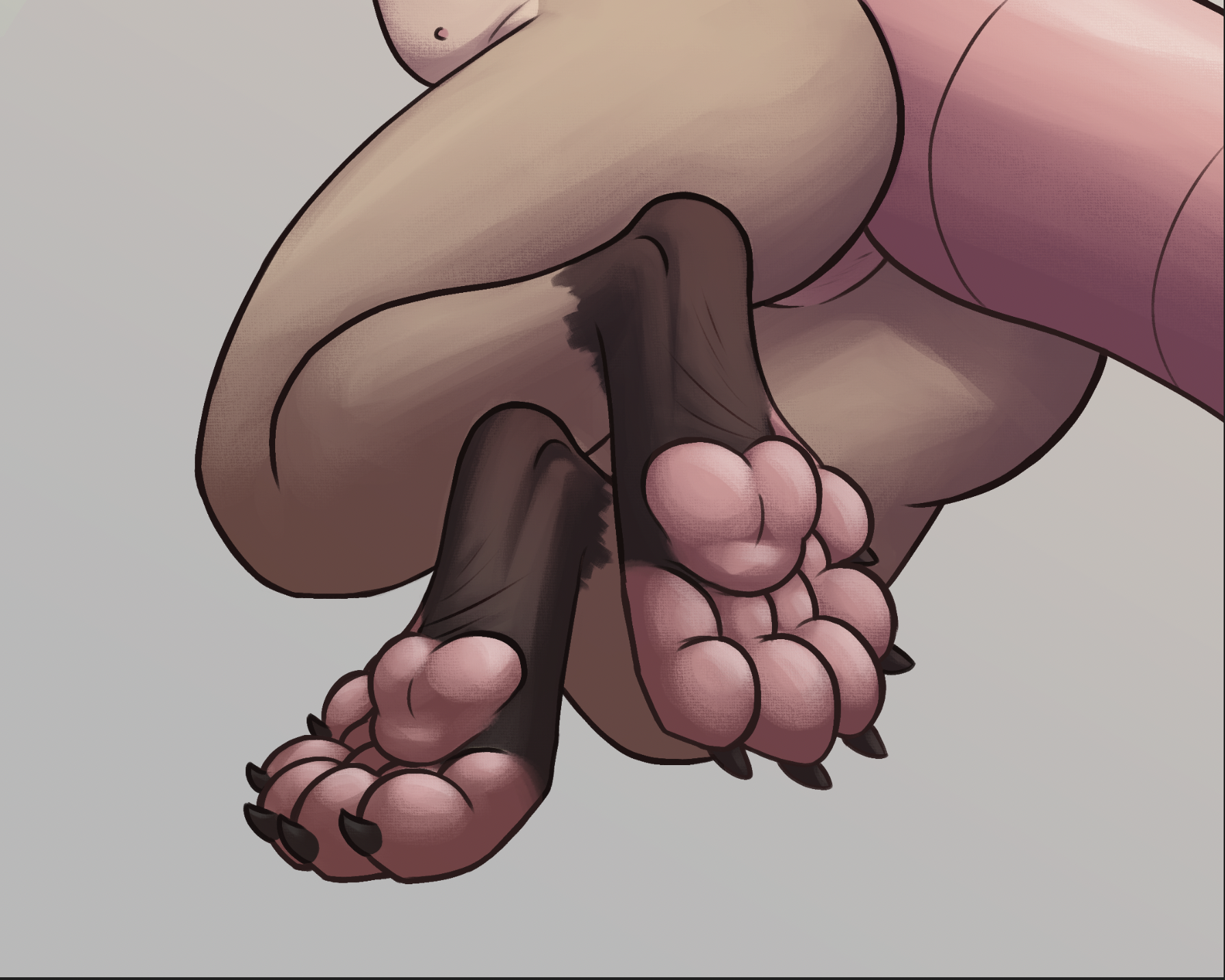
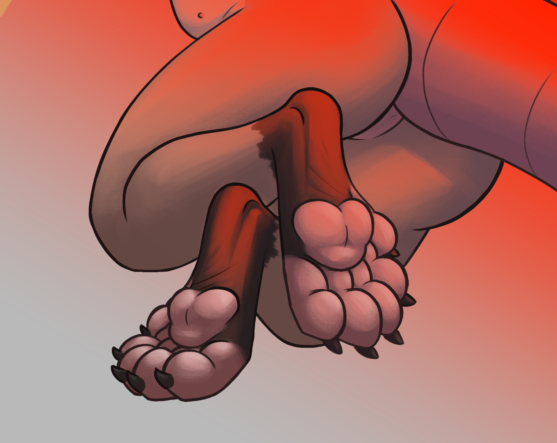
and lastly i added a leather texture overlay, just as a small touch, it's something i noticed other artists using to make their art pop out more so i decided i'd give it a try too
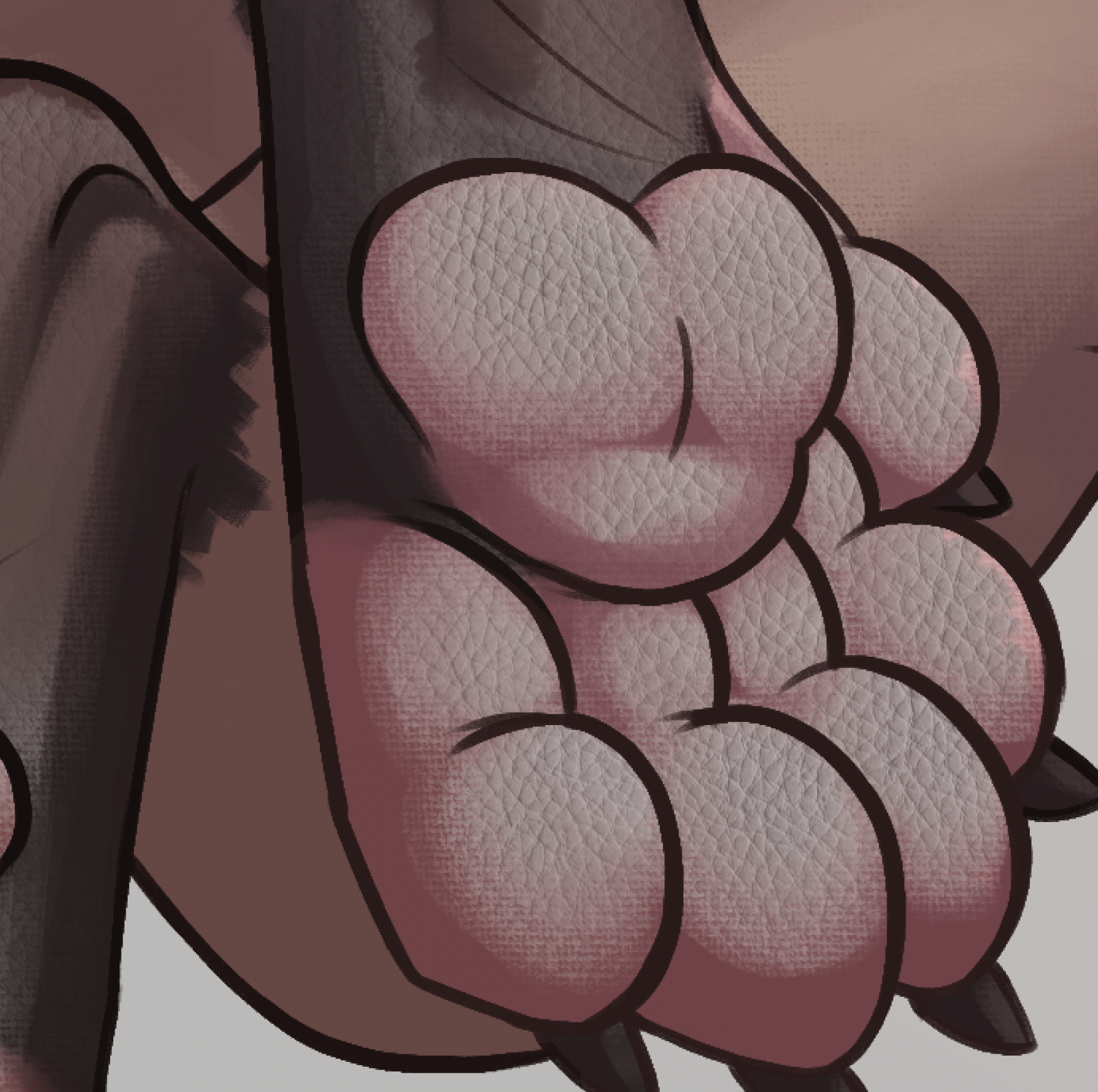
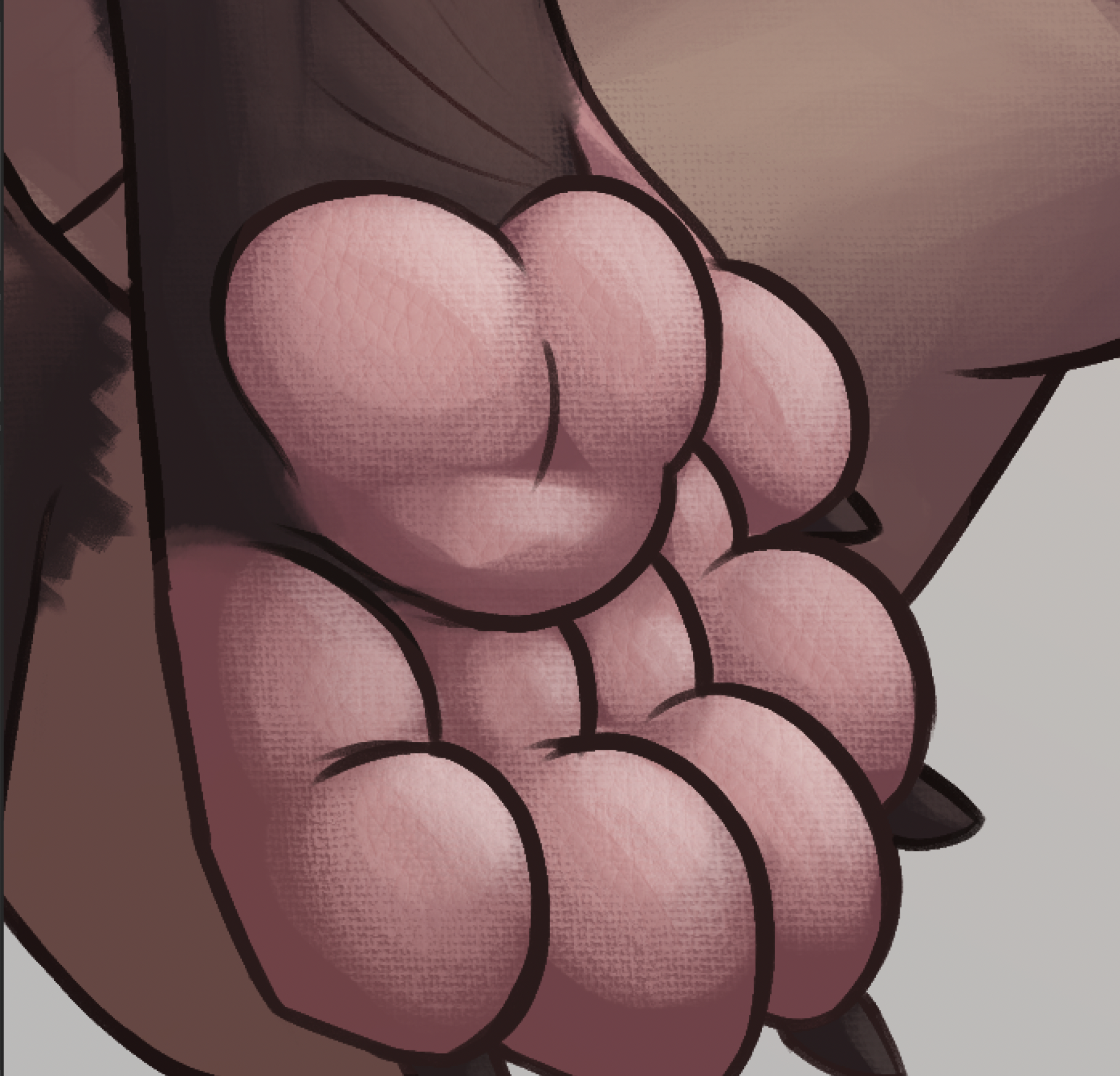
you may notice that the work in progress pics have like, wrinkles above the paw pads - i removed those as a last minute change because they didn't make much sense with the anatomy being digitigrade otherwise. ok that's all! thanks for reading
LISTENING TO
crywolf
PLAYING
abiotic factor
FEELING
pawtastic
OUTSIDE IT IS
freezing and windy!
more reading
next post:
rain world: the watcher
previous post:
Raising the Hoof
comments
press "sign-in" to add your name - no login needed!